Michelle Fournier
10 Amazing Shelter Websites Designed to Inspire
Compassion. Professionalism. Safety. Love. Success. There are a number of different messages we need to convey through our websites and therefore a lot to consider when creating or updating a Shelter site. Understanding, and clearly communicating with varied audiences of adopters, donors, potential volunteers or employees as well as trustees can be overwhelming and lend itself to a confusing or challenging website journey.
As with most things, there is a formula for success in designing a website that will make your Shelter stand out and it starts with knowing there is no ego in site design. Your website is about your site visitor and the goal of having them leave your site satiated, journey fulfilled. If they enjoy their experience, they’ll tell people about the ease of the process, and when it comes time for that person to adopt, volunteer or donate, your Shelter will be top of mind.
A rock-solid website from layout design, to language, to content, to imagery is critical to your Shelter’s success and credibility. It’s your calling card in a crowded virtual world, and as we move to an even more online society, it’s time to evaluate where you are in the crowd, and what it will take to get you to the top.
There are some things that just are innate to human behavior, like chewing, breathing, or loving dogs, we are programmed to know and understand that the nav bar is at the top of the page, the menu lives in the top left or top right corner of the page. Don’t mess with certain tenants and intuitive placement of common actions is one of those things. Simply put, don’t make your visitors work too hard to explore your site, make it easy for them to enjoy and find what they need, serve it up to them. If they are forced to work too hard to find what they’re looking for, the “X out” action is one everyone can do blindfolded.
Keep your site clean, uncluttered and put your most important information front and center. If you are hosting your Gala or in desperate need of funds make sure your visitor knows that, they will be much more inclined to help. If your Shelter is on a schedule of regularly updating content and landing page images, maybe it’s time to bring in some engaging video as it helps audiences relate to and engage with your content, and can boost conversions and action by 80% in some cases.
We have had the pleasure of getting to know a lot of amazing shelters over the past few weeks, and we have been blown away by some best in class websites that are doing it right. Check them out:
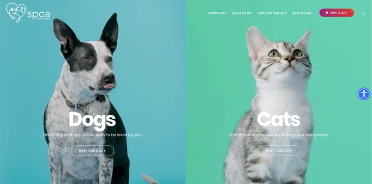
SPCA Northern Nevada ~ From first glance, this site with its warm color palette and engaging animal video brings the visitor immediately in. It’s a site that calls for exploration, and from page to page throughout the journey delivers important information effortlessly.
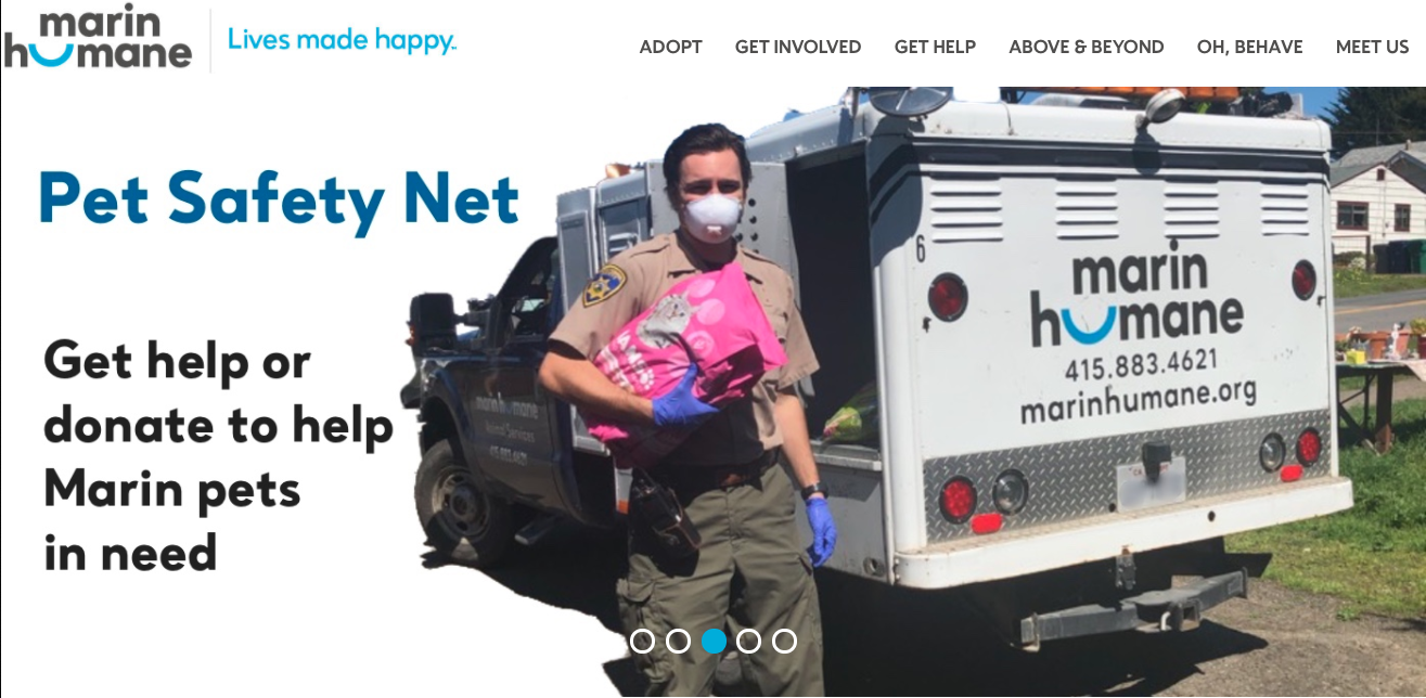
Marin Humane Society ~ For an independent Shelter that helps more than 10,000 domestic animals per year, ease of use for visitors is key to keeping them on the site, and getting them where they need to be. This site is clean, easy to navigate and incredibly current.
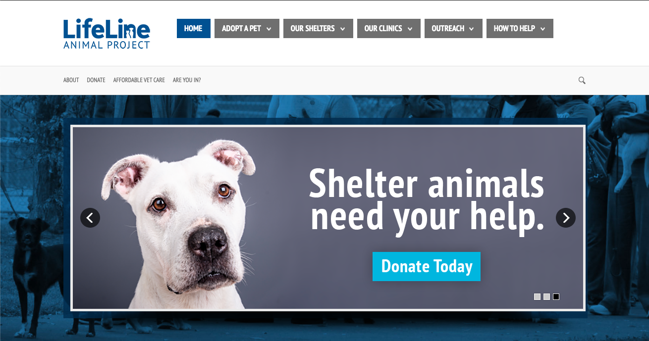
Life Line Animal ~ The landing page carousel delivers the message “Homebound, to Home Bound” with an image of a stocky, smiley blue nose pitbull galloping towards the visitor. From that moment, an animal lover is captivated. This site wins on first impression and delivers page after page.
Houston SPCA ~ Robust, engaging and purposeful best describes the Houston SPCA site. Not simply easy to navigate, but an outstanding use of video on the landing page is likely to elicit action from site visitors.
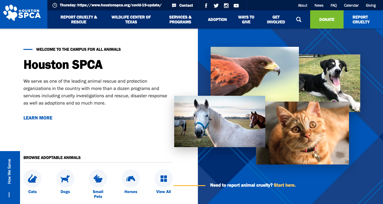
Animal Welfare League Arlington ~ I don’t know about you, but a video of a senior dog receiving love and looking happy on a landing page will keep me coming back every time.
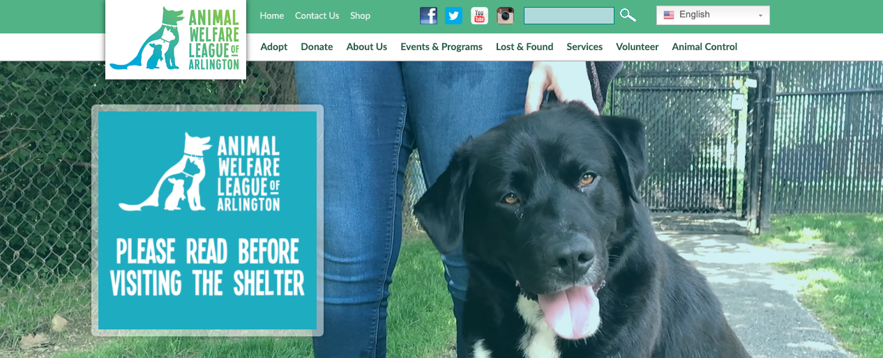
Humane Society of Southeast Missouri ~ Ahead of the design curve, this site is hip, funky, sleek, easy to navigate and frankly fun to dig into. The capital campaign video on the home page allows for the Shelter’s mission to be delivered in a modern, unforgettable way.
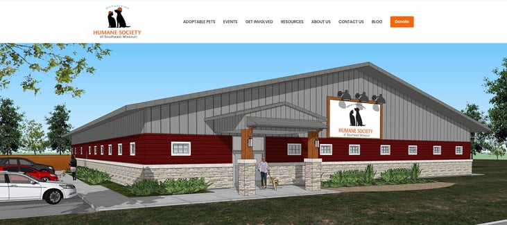
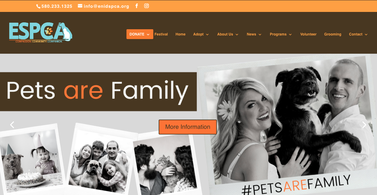
Enid SPCA ~ A perfect example of keeping it clean, uncluttered and easy to navigate with a focus on family.
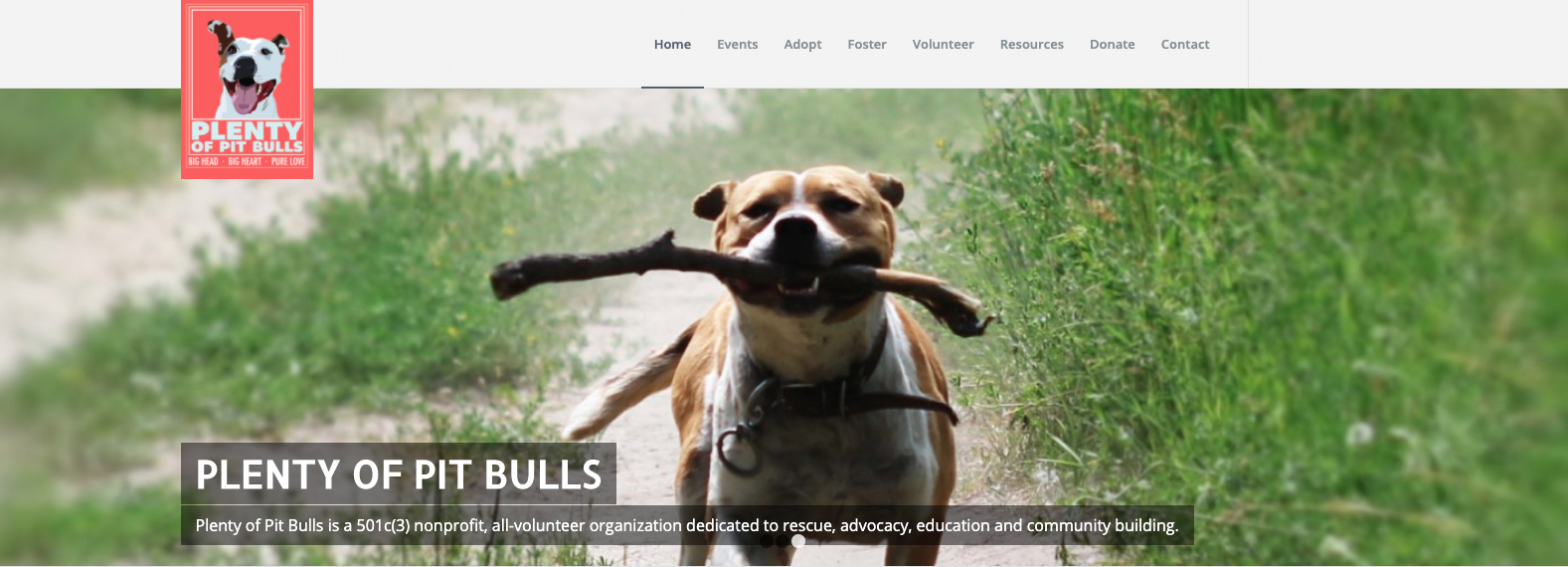
Plenty of Pit Bulls ~ As a breed specific site, the mission of rescue and rehabilitation is clear and the crisp photography coupled with the storytelling deliver that mission beautifully.
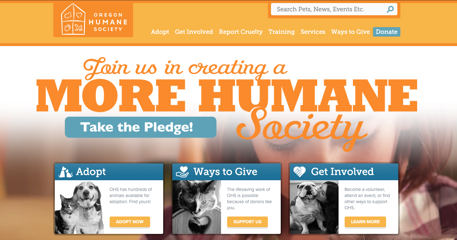
Oregon Humane Society ~ Bold colors, coupled with consistent messaging and an up to the moment adoption counter makes this site a pleasure to discover. Not ready to adopt, OHS offers plenty of other ways to help animals with a simple click.
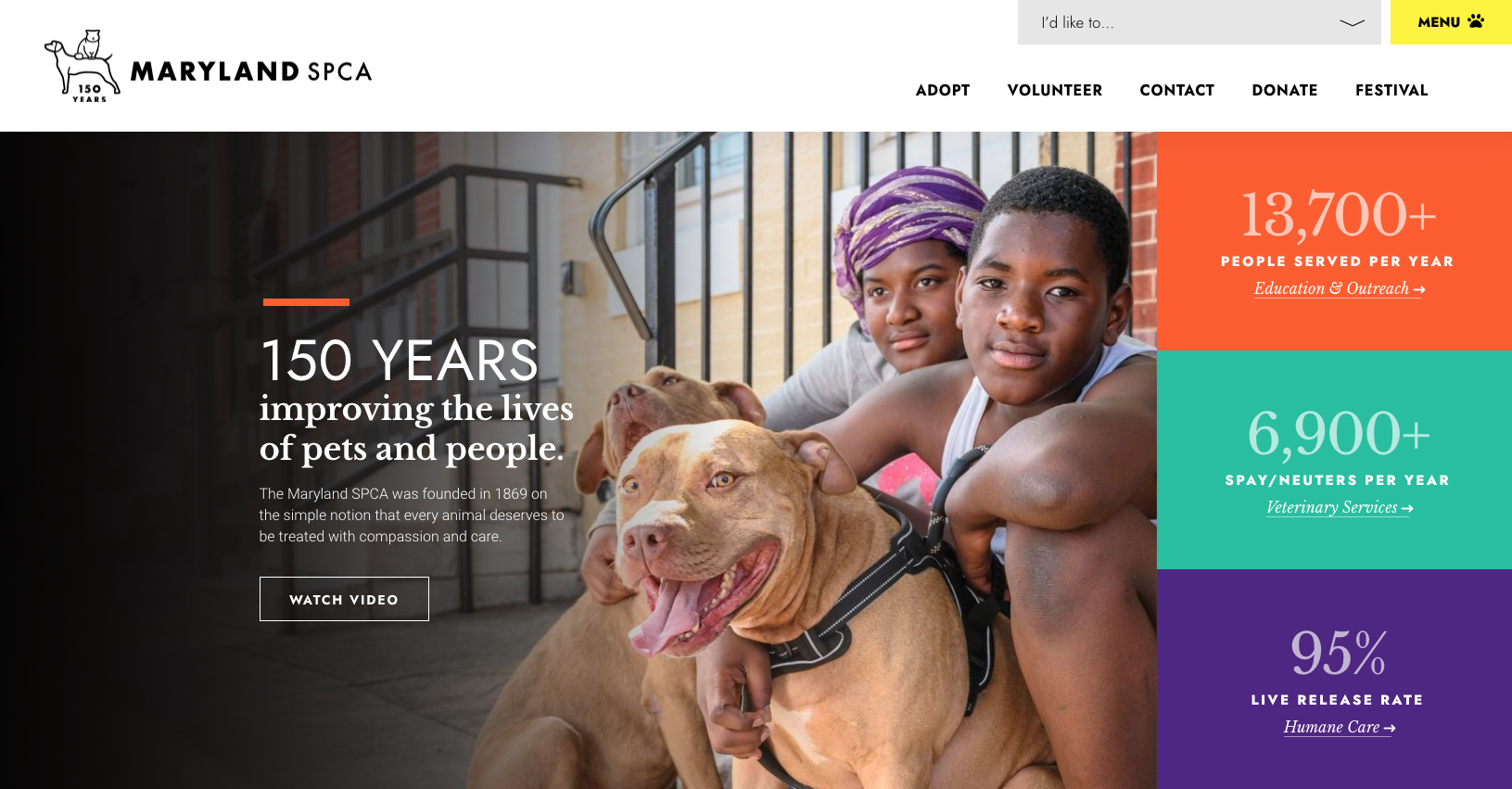
Maryland SPCA ~ Information and data is front and center on the MDSPCA website, delivered in a dynamic, attention grabbing way. The numbers are impressive with a 95% live release rate, and nearly 7k spay/neuters per year, this organization is working hard to connect pets to families and are excited to spread their news.
If you enjoyed this post, please share it!


Submit a Comment